How to Track NFC Business Card Views and Analytics
The short answer: Open your eylet app, tap the Analytics tab, and you'll see views, taps, link clicks, contact saves, exchanges, visitor location, session time, and unlimited history — all included free. This guide explains what each metric means and how to use it to follow up smarter after every networking event.
Paper business cards gave you nothing. You handed them out, walked away, and never knew if anyone even looked at them. NFC digital business cards flipped that completely. Every tap, every view, every link click — it all gets logged. The data is there. The question is whether you know what to do with it.
This guide breaks down exactly what NFC business card analytics tracks, what the numbers mean in plain English, and how to turn those metrics into better follow-up habits.
Why Analytics Matter on an NFC Business Card
Most professionals tap their card, hand it over, and move on. But without analytics, you're flying blind on a few important questions:
Analytics answers all of these. And once you know what's working — which links drive action, which events generate the most views — you can double down on what matters and drop what doesn't.
What NFC Business Card Analytics Actually Tracks
Here are the core metrics you get with a good NFC business card platform — and what each one actually tells you.
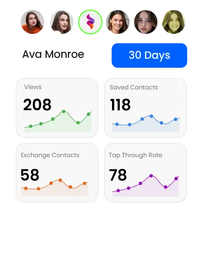
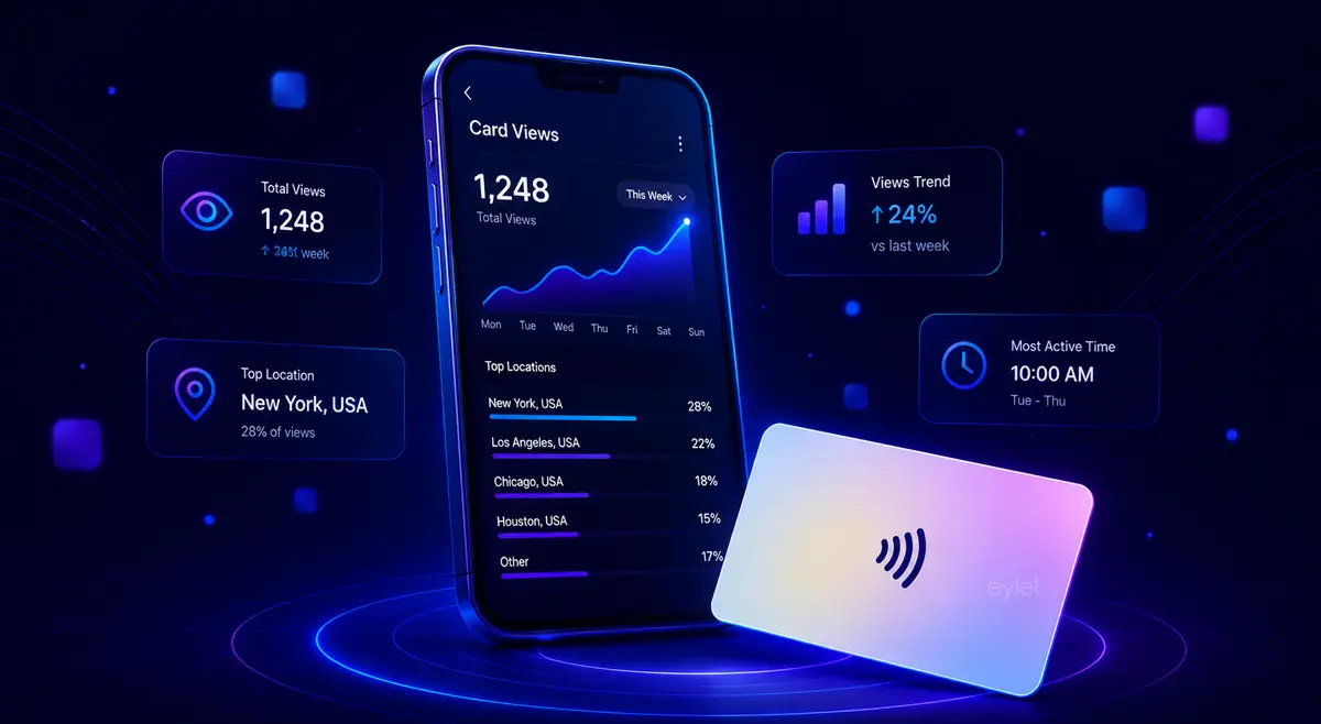
Total number of times someone opened your digital business card profile — whether from an NFC tap, a QR scan, or a direct link. This is your baseline reach number. After a networking event, a spike in views tells you the event was worthwhile. A flat line means your card isn't getting in front of people.
Counts specifically how many times your NFC chip was tapped (phone-to-card) versus how many times your QR code was scanned. Useful if you're using both methods — it tells you which sharing method your contacts prefer. Most professionals find NFC dominates at in-person events and QR takes over when sharing links remotely.
Breaks down exactly which links on your card were tapped and how many times. WhatsApp: 3 taps. LinkedIn: 1 tap. Phone: 2 taps. This is one of the most actionable metrics on the dashboard. If your WhatsApp gets 3x more taps than your phone number, your follow-up strategy should lead with WhatsApp. If nobody's clicking your website, maybe it's time to reconsider how it's positioned on your card.
How many people saved your contact details directly to their phone from your card. This is the strongest buying signal in the analytics dashboard. A view is passive. A saved contact means the person decided to keep you. If your views are high but saves are low, your card may need a clearer call to action — or a more compelling profile summary.
Counts two-way exchanges — where both you and the viewer shared contact details with each other. This is the highest-quality lead signal. Someone who exchanged contact info is far more likely to follow through than someone who just viewed your card.
The percentage of viewers who clicked at least one link after opening your card. Think of it as your card's engagement rate. A tap-through rate of 50%+ means your profile is compelling people to act. A low rate (under 20%) often means your most important links are buried too far down or your card layout isn't drawing attention to the right things.
Each view logs the city and country, device type, operating system, browser language, time zone, and session duration. This is useful for spotting patterns — if you're getting views from a specific city you didn't expect, it might mean a contact forwarded your card. If session duration is under 5 seconds, visitors aren't spending enough time to engage.
Daily, weekly, and monthly activity charts showing when your card gets the most views. Useful for post-event analysis — you can see a spike on the day of an event and watch how engagement trails off over the following days. Helps you decide when to follow up: if most activity happens within 48 hours of a tap, that's your window.
How to Access Your eylet Analytics Dashboard
eylet includes all of the above analytics for free — no subscription, no upgrade required. Here's how to find it:
How to Actually Use Your Analytics Data
Knowing the metrics is one thing. Knowing what to do with them is another. Here are four practical ways to turn your NFC card data into better results.
Your analytics will show a spike in views in the hours after an event. Most engagement happens in that first 48-hour window. Check your dashboard after every event and prioritize reaching out to anyone who saved your contact or exchanged details — they're the warm leads.
If WhatsApp is getting 3x more clicks than your phone number, move it higher on your card. If your portfolio link is getting zero clicks despite being prominently placed, try a different label or position. Your links tap data is direct feedback on your card layout — use it.
If you attend multiple networking events, your daily trends chart will show you which ones generated the most card activity. Over time this tells you where your time is best spent — and which events are worth repeating next year.
If your average session duration is under 10 seconds, visitors are bouncing without engaging. This usually means your profile is too cluttered, your photo or banner is missing, or there's no clear prompt to take action. A well-designed profile with a clear bio and prominent contact links will hold attention longer.
What Most Platforms Lock Behind a Paywall
Not all NFC card platforms give you the same analytics access. Here's what typically gets paywalled — and what eylet includes free.
Most platforms (Blinq, Popl, HiHello) give you basic view counts for free but lock the useful stuff — per-link data, visitor location, unlimited history — behind Pro or Business plans. eylet includes the full analytics suite with every card, no upgrade required.
Ready to Start Tracking?
If you're currently using a platform that hides your analytics behind a paywall — or you're still handing out paper cards with no data at all — eylet is worth a look. One card purchase, no monthly fee, and you get the full analytics dashboard from day one.
The eylet features page has the full breakdown of what the analytics dashboard includes. eylet cards are available direct from eylet.com or on Amazon for fast US delivery.
If you want to understand what separates eylet from the subscription-based alternatives in more detail, the eylet vs Popl comparison covers the full feature and pricing breakdown.
Frequently Asked Questions
How do I track views on my NFC business card?
Open the eylet app and tap the Analytics (Insights) icon on your profile. You'll see total views, tap counts, link clicks, saved contacts, contact exchanges, and a tap-through rate — all updated in real time. No extra setup required.
What analytics does an NFC business card give you?
A good NFC business card platform gives you: total profile views, tap and scan counts, per-link click breakdown, contact saves, contact exchanges, visitor location and device data, session duration, and time-based trend charts. eylet includes all of these for free with no subscription.
Can I see who viewed my NFC business card?
You can see when and where your card was viewed, the device type, browser language, city, and country of the viewer, and whether they saved your contact. eylet does not show individual names unless the viewer chooses to exchange contact details with you.
Do I need a subscription to see my NFC card analytics?
With eylet, no. All analytics — views, taps, link clicks, contact saves, exchanges, visitor location, and unlimited history — are included free with every eylet card. No monthly subscription required.
What is tap-through rate on a digital business card?
Tap-through rate is the percentage of people who viewed your card and then clicked at least one link — your phone number, WhatsApp, LinkedIn, website, or other links. A higher tap-through rate means your card content is resonating and driving action beyond the first view.